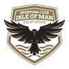
We are delighted to reveal our new Club Crest, designed by Eden Creative.
In line with the philosophy of our parent company Sporting Club Isle of Man, the crest has been carefully crafted to not only reflect the essence of our Island’s history, colours and community but also, importantly, to represent our confident sporting approach.
The full brand story will be released soon, but here are some of the key design elements:
- The Black Raven is one of the national birds of the Isle of Man and is synonymous to Celts and Vikings with battle, intelligence and problem solving – and is depicted ready to attack
- The red and white colours represent our stunning sunsets and infamous Manannan’s Cloak
- The four water lines represent the North, South, East and West of the Island, symbolising unity and community
- The words “Bee ny Share” is Manx Gaelic for “Be Better”
FC Isle of Man Sporting Director Paul Jones stated:
We are delighted to unveil our new Club Crest, which mirrors the philosophies of Sporting Club Isle of Man.
The design values within the crest are set to inspire our home and away kits, which we’ll be providing more details in the coming weeks.


